A new Ning.com
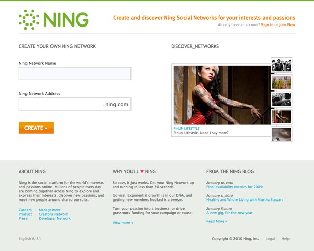
General Ning News UpdatesToday, we’re rolling out a new Ning.com design with a new Ning Network discovery feature. Here’s the new Ning homepage:

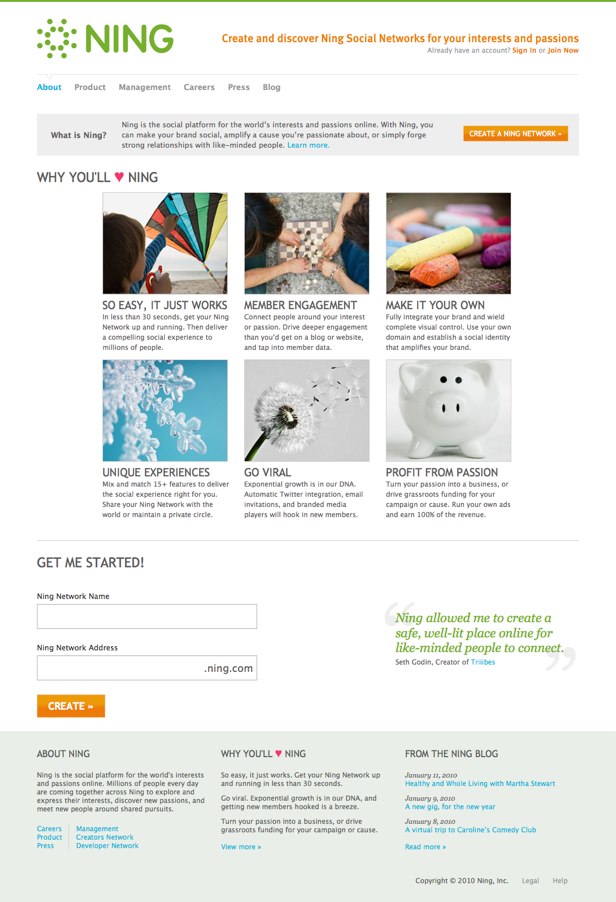
This new design strives for a clean, simple and elegant design with pops of beautiful images to represent the diverse interests and passions across the Ning Platform. You’ll see these new visual changes across Ning, including the Creators, Developer, the Ning Help Center and here on the Ning Blog. Our new logo will also replace our old logo in the Ningbar you see at the top of your Ning Network. Here’s the new Ning About page:

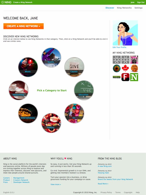
Most importantly, as we mentioned back in November, when we simplified Ning.com and removed search and our cross-Ning activity feed, we are launching a new Ning Network discovery feature today. Here’s a snapshot:

The categories are based on our most popular across Ning and, within each category, related Ning Networks are recommended based on the overlap between members. Our goal with this feature is to provide an easy – and interesting – way to surface popular and compelling Ning Networks to people based on the things they care about. We’ll use this new Ning Network discovery feature as a foundation for further recommendations and ultimately search across the Ning Platform.
Looking forward to your feedback!

nice design! I’m impressed =)
Thanks once again. You are adding some fabulous ways to promote our network. We have seen a lot of new visitors and new members joining us since you added this. In fact looking at our Google analytics account we have seen over 3500 visitors to our newtwork from this link alone, of which 62% are new visitors.
Thanks for all the hard work you guys are putting into this, you really are overdelivering.
What is the easiest way to get started with my own .ning.com? How do we add music? Pictures and forums? Friends?
Hello. Love the new design and the new features. I would like to request though that one simple feature be added. It would be perfect if group administrators could delete posts by other members such as on the comment wall.
Thank you,
Crystal
Sorry, but nothing exciting here. I think I speak for most when I say Ning.com is really not all that important to a network creator. The only traffic I get from other networks (or Ning.com) is spam. In fact I have been getting a lot more spam in the last month or so. Enough to annoy me. Yet even though you have already upgraded Ning.com within the last year, you have spent valuable time doing so again. In my opinion there are many, many other features we could really use to grow our networks then to update your home page. I used to follow this blog daily because there were constant updates to the platform going on. Lately it’s very stale. How about updating resend invites so we can see when we last resent it? How about a latest activity box that takes up LESS space, but shows MORE activity (scroll or “more” link).
It looks good to me!! Will I be able to charge new members to my network a membership fee??
We’re honored to be not only featured on the main page, but in the screenshots above!
Also as previously stated to Gina, I absolutely love the new logo.
e
I would like to say I love the new blog and all its features….would and may get one for ours. Great job
Hi,
I’m a French user. I wanted ti tell you how much I think Ning is good. According to me, this is one of the best social network at the moment : it’s private, with great opportunities of design, many functionability…
The only thing which is not so convenient is the way to discover new Ning pages. By exemple I would love to discover other French ning pages… How can I do ?
Anyway, great work !
Geraldine
Thank you Gina 🙂 The Music section on the discovery part is great lol – Can’t complain there at all!
The new logo is great and the site design is crisp and clean… i love it!
Thank you Gina, I don’t have to explain why I love this new Ning Network discovery feature. I am so thankful that people find with this feature my and some other related Ning Networks so much easier. Great!
The new logo is great and I like the way the discovery feature echos the logo. However, discover is not working well. While I like browsing to find things of interest based on affinities, I need to have a good starting point. The current discovery feature lacks a way for me to start in the right place – everyone has to start in one generic place. Since connections are based on popularity, I will never find a network unless it is popular. So I suggest this; let users enter criteria at the highest level (a couple of fields in the center of the network ring). Those terms set the initial discovery ring. I can then drill down from there. A way to tweek the discover rules would be good as well – like choose newer networks or older networks or popular networks or allow me to ask for some more randomized results that still fall within my criteria. I think allow folks to have more control over the discovery browser would make it really fun to browse networks. As it is now, I just think I’m missing tons of stuff.
Looks great guys- very clean! I love the new logo too. Keep up the good work!
So where are these Categories for use to put our own Networks? I see no category option in my network profile/account.
wow it looks great
” (…) we are adding search back in the near future.”
Ok, now I got it! With the search back the new Ning will be perfect.
I love ning.
It’s forced my to learn CSS and to learn CSS I had to lean HTML
So my use of ning has not only caused my online profile to grow but my mental capabilities.
But.. My only bone to pick, (2 bones to pick)
I am not able to make a “my Friends” tab, I am not too sure how to do that.
And the 3rd picture down.. ever hear of anything of spruz.com ?
I joined Ning yesterday and spent a good half hour frustratedly searching the web for ways to find the right ning network for me. I don’t want to create a ning network, I want to join one! I read this blog, and found that you were making some changes to the site and checked back again today.
Though the new ‘discover’ thing is lovely, it’s completely worthless for someone who actually wants to find something they might like.
What you really need is a simple search box where a ning user can type in a keyword and find ning networks that match that keyword.
I don’t want to ramble on, but I’m simply frustrated.
Even if I did create my own ning network, because I can’t find what I want, nobody else would join it because there is no way to find it on your site!
Nina,
I appreciate that is doing a little something to help people find great communities.
However, I”m perplexed why “education” isn’t up there????? I think that even if it isn’t “huge”, Ning owes it to the coming advent of social learning, to be proactive and promote the discovery and participation in educational communities. My vote for adding Education!
David
Strumelia,
Appreciate where you are coming from and we are adding search back in the near future. In the interim, this discovery feature is a “top down” way to navigate popular Ning Networks in our most popular categories. It’s not designed to find bowed psaltery Ning Networks, so in that respect, I could see how it is useless but for everything else I think it’s pretty hot 🙂
Gina
Sorry, but that “Discover” feature is pretty useless for me. How on earth would anyone discover a music NING network like mine for mountain dulcimers, or the bowed psaltery music NING site, or the worm composting vermicomposter site I like?
For music, if I tried to locate my own network, all it shows are networks that are either rock and hip hop, and with network names that give me no clue at all as to their content, so it’s random to follow them. I wind up in some nowhere land when I really know exactly what I’m trying to find but there’s no way to get there by choosing circle after random circle. Was this your intent?
Why can’t you give **network creators** a search function like you used to have, to find other NING networks by keywords and subject??? I’d hate to start a redundant NING network on a subject that is already nicely covered by someone else.
We absolutely NEED to be able to find other NING sites by subject and keyword…
please please please ??? I think it’s bizarre not to have this ability to find other NING networks by subject.
The new icon is very symbolic. It was a great choice.
Great. Beautiful. But in which category are the religious or philosophical networks like mine?
Would like to feedback – Logo very cool and the new Discovery ( Octogan Circular Search ) is a really nice looking array which works. In fact 99% of what you have done has moved NING forward – but the ability to browse Networks ( I know there were abuses) is a big step backwards from my perspective – I know the current Discovery will be improved but it seems to only bring up a select few Networks out of the plethora of those available. Apart from that a massive thumbs up – Have a great 2010 to all !